Bitiba Membership
Web app | Feb 2025 - Jun 2025Bitiba was relaunching as a leaner, price-first pet supply platform. I joined as design lead partway through development, with two jobs: tighten the MVP before launch, and build a membership concept from nothing. Four months, a live codebase, and a team already moving.
The hard part
A membership on a discount platform has an awkward problem at its centre: the whole promise is that things are already cheap. Asking someone to sign up for cheaper-still means proving the saving is real, doing it on a page that also has to work for people who haven't joined, and doing none of it in a way that feels like a sales pitch. Making the value obvious, the sign-up frictionless, and the whole thing trustworthy is easy to write down and harder to draw.
No brief
Writing the scope
Where the offer belongs
Writing the scope
There was no design brief at kickoff. Not a vague one, none. So the first piece of work was writing it. Through stakeholder conversations and a look at where the platform actually stood, the scope came down to three things: make the price advantage visible and credible, introduce a lean membership to drive registrations, and clean up the catalogue behind the scenes.
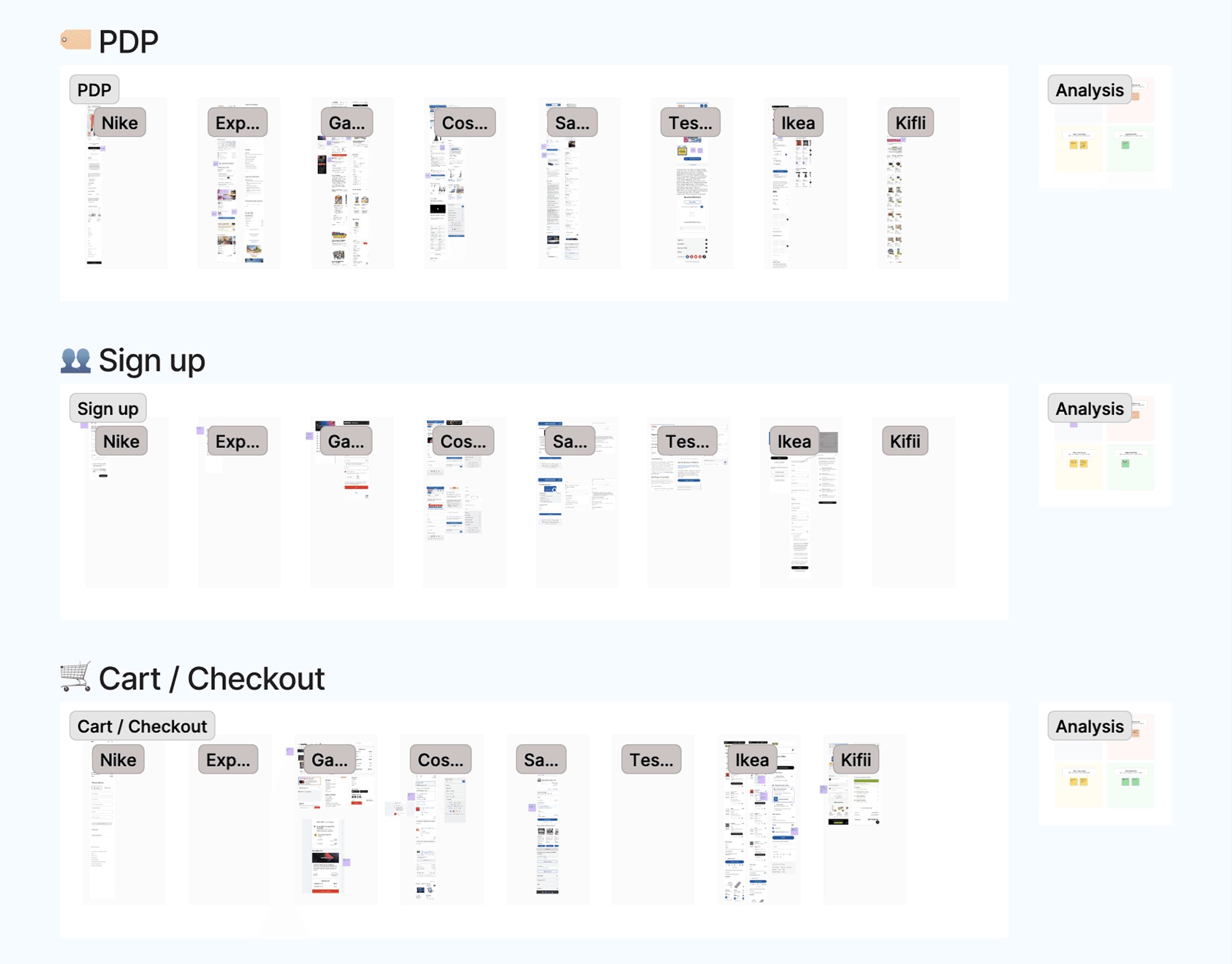
Before designing anything I looked at how other European retailers run lean loyalty programmes, weighing tiers, pricing visibility, and how the membership sits inside the shop rather than beside it. The useful finding wasn't a feature, it was a pattern: the programmes that work say what you get before they ask for anything, and they keep one recognisable voice across every screen. The ones that don't bury the benefit behind a sign-up wall.
Where the offer belongs
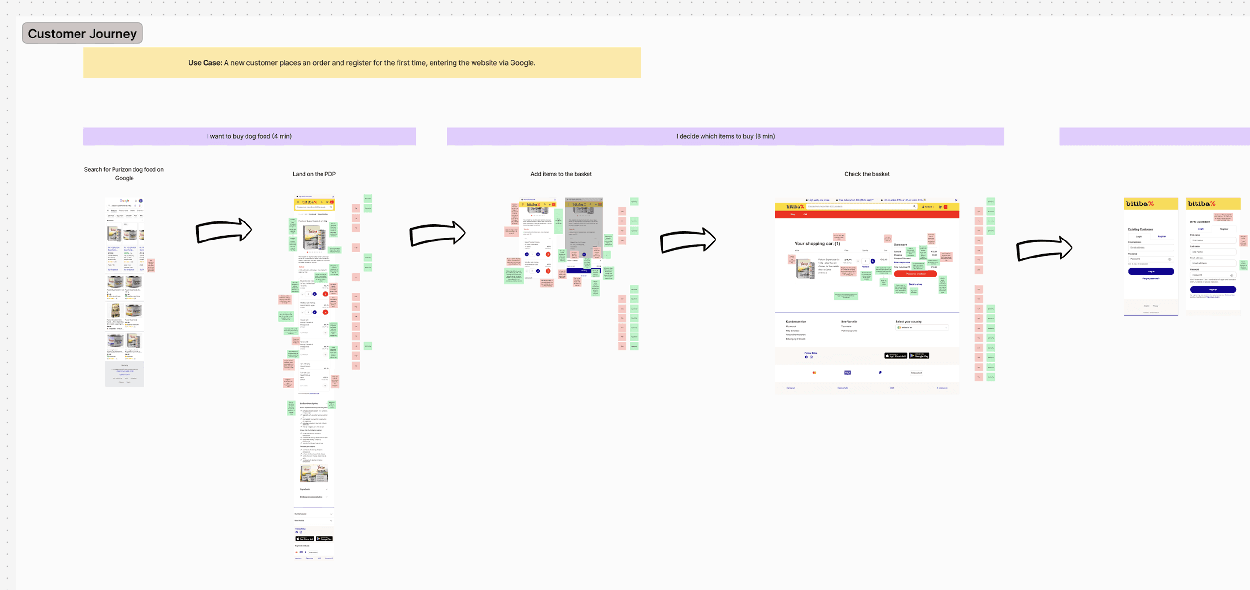
I mapped a simplified customer journey, less to document it than to have something on a wall the team could argue with. It worked, because the map turned into a short ideation session, and the session is where the integration points actually got decided.
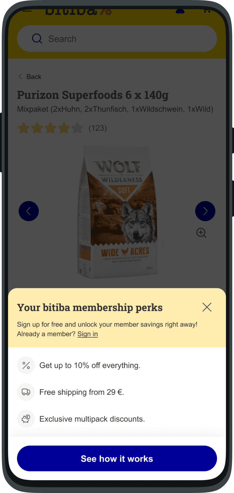
Three came out of it and they set the rest of the project: show the saving early, on the product page, before anyone is asked to commit; fold registration into the shopping flow instead of making it a detour; and say something after the purchase, when the benefit has just been felt rather than merely promised.
The ambitious version
What I pitched
What shipped instead
What I pitched
The first direction treated the membership as its own thing: a name, its own palette, branding that made it recognisable wherever it appeared. The competitor work supported it, as identity was one of the three things the good programmes had in common, and a membership with a face is easier to talk about, easier to market, and easier to extend later.
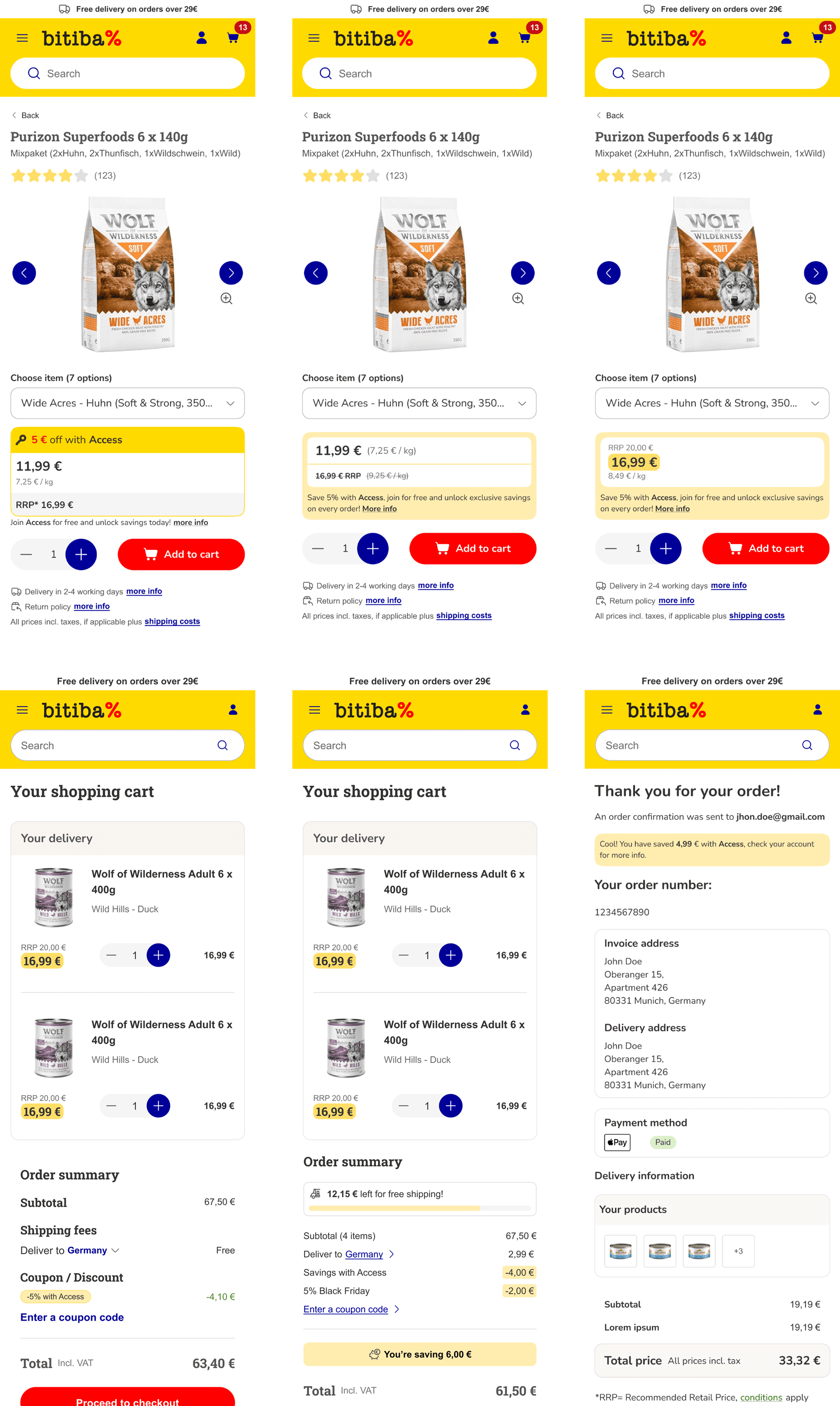
What shipped instead
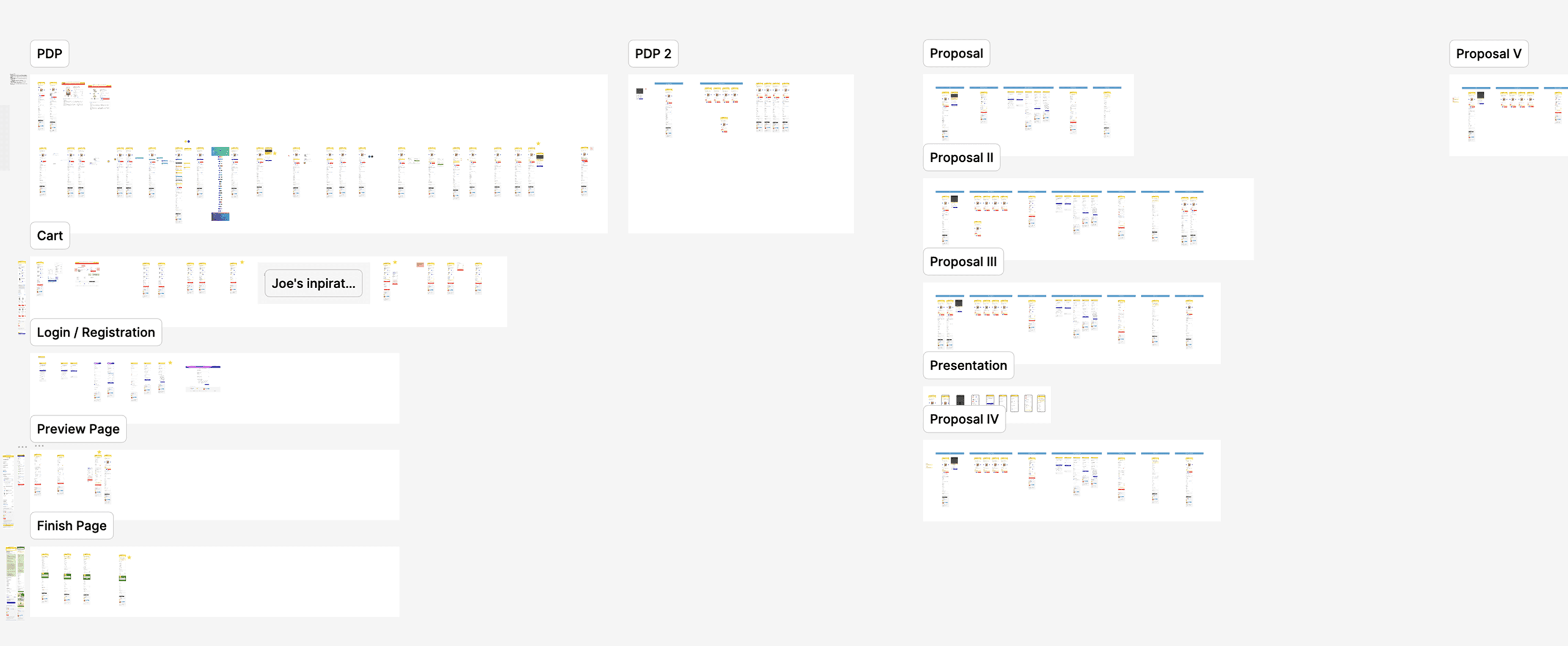
It got scaled back to one thing: access to lower prices. No name, no separate identity, no second brand to maintain. Stakeholder priorities and the timeline, and I pushed on it more than once before agreeing.
They were right, and it took me a while to see it. A separate identity on a platform whose entire proposition is this is the cheap one is a second story competing with the first. The lean version says the only thing that needed saying. What I did hold onto was the structure underneath, made up of the integration points, the messaging slots, and the places where a richer offer could go later without a rebuild.
The live nature of the platform pushed me into high fidelity earlier than I'd normally go. Wireframes are cheap to change and expensive to argue about with people who are already building.
Showing the savings
Two prices, one page
Two prices, one page
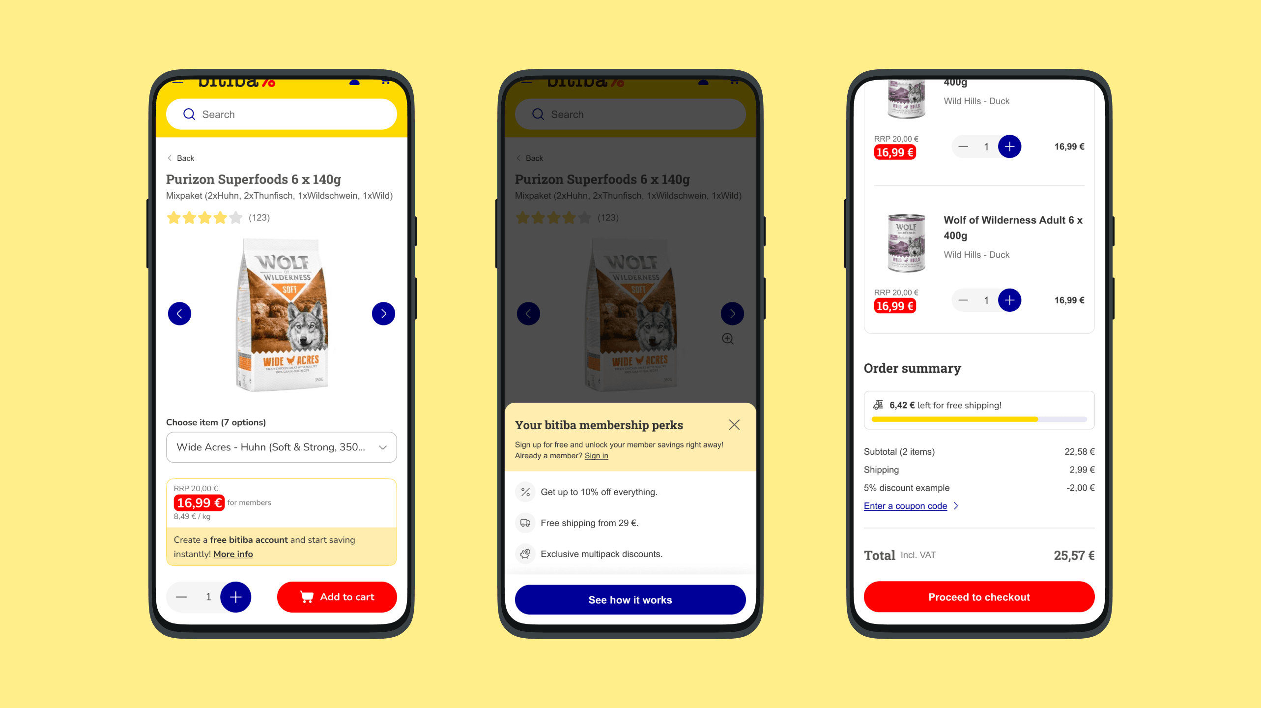
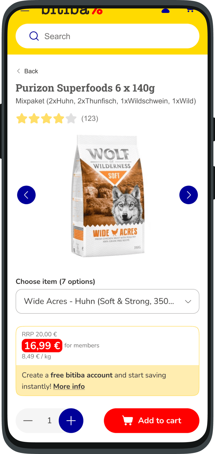
The hardest screen was the product page, and the reason is arithmetic. It has to show a member price and a non-member price at once, make the gap between them obvious, and still read cleanly to someone who has no intention of joining. Push the member price too hard and every non-member feels they're being charged a penalty. Underplay it and nobody signs up.
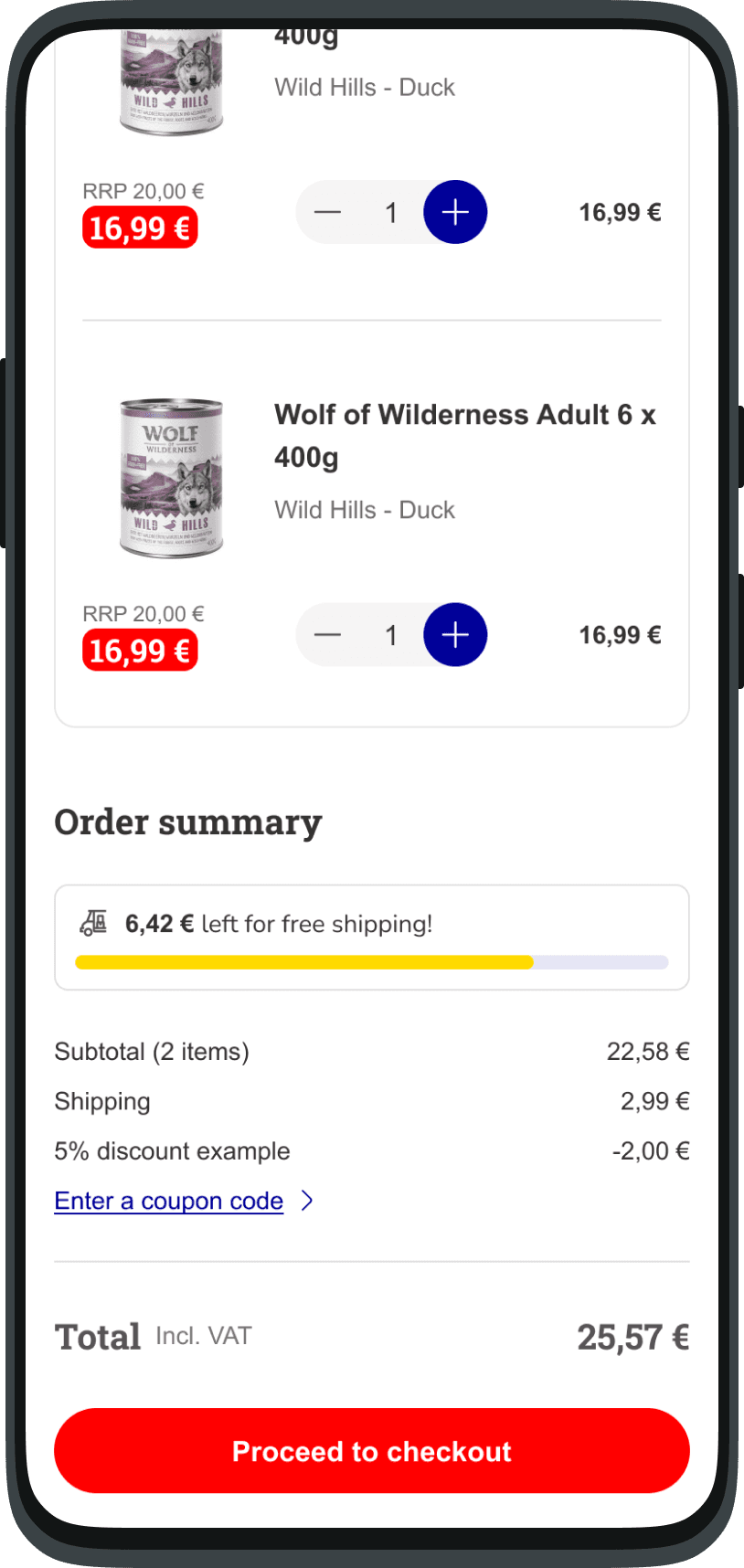
What settled it was giving each price a different job rather than a different size: the RRP struck through as context, the member price as the number you act on, the saving stated plainly rather than dressed up as a badge. The same logic runs through the basket and the order summary, where the discount stays broken out on its own line all the way to the total, so the number never has to be taken on trust.
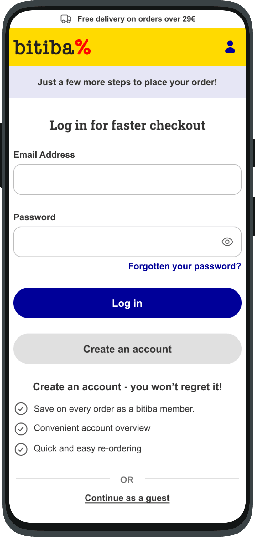
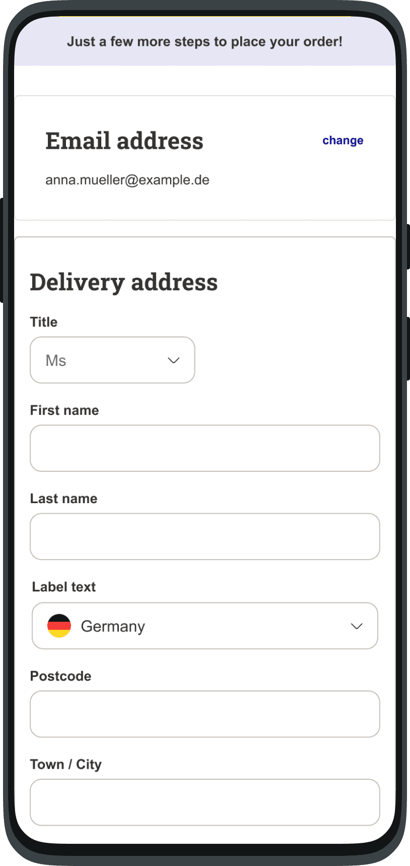
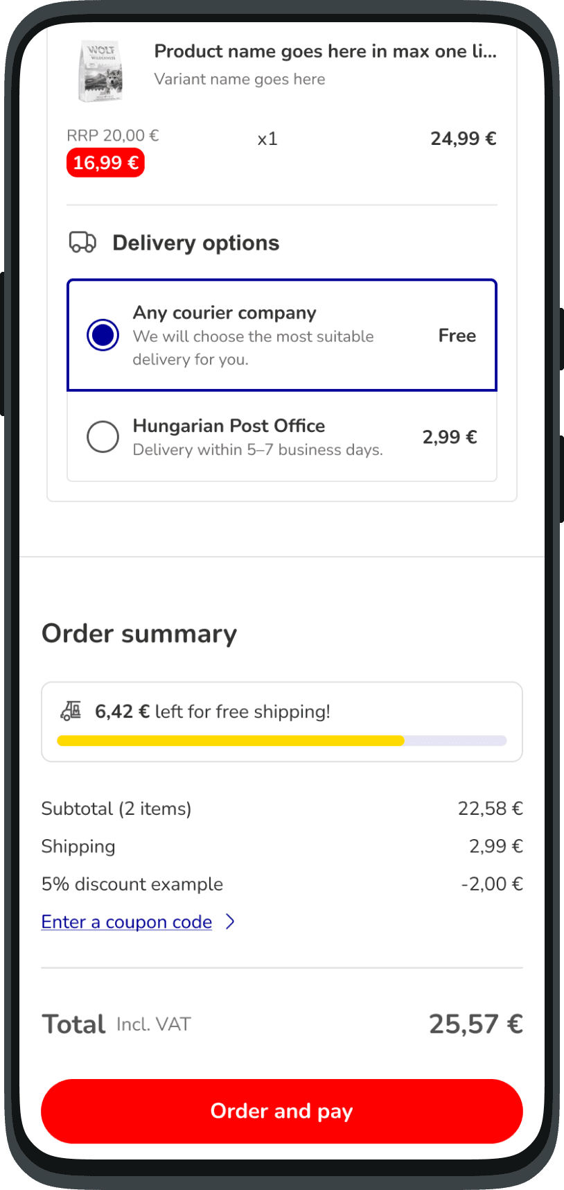
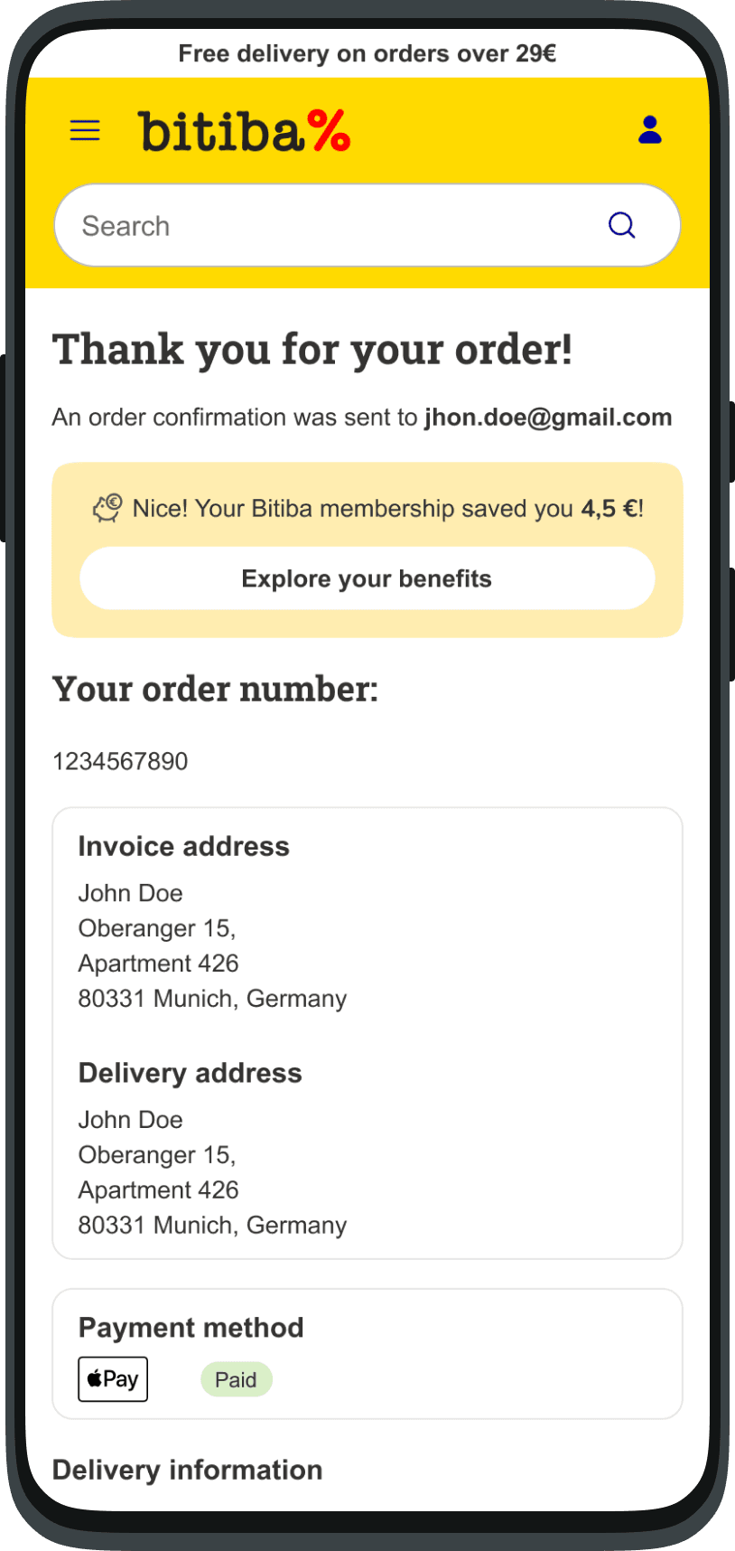
What testing changed
Ten people, two versions
Ten people, two versions
Moderated sessions with five colleagues and five potential customers, running both the current site and the new prototype from product page through to purchase. Same task, both versions, so the comparison came from them rather than from me.
Most preferred the new one, and for the reason it was built: they could see what they'd save without having to work it out. That was the part that held.
Two things didn't. Several people understood the discount perfectly and still couldn't explain what the membership actually was. The saving landed, the programme didn't, which meant the messaging was doing half its job. And in checkout, where the simplified address entry went down well, people asked for guest checkout: removing the detour into registration had quietly removed the option to skip it entirely.
Both went back into the design, touching copy, layout, and how the membership gets explained rather than just applied.
See prototypeTakeaways
Joining a project already in motion, with no brief and a team mid-build, means most of the design work happens in conversation rather than in Figma. The journey map earned its place because it gave people something to disagree with; the competitor research earned its place because it gave the argument for the ambitious version a spine, even though that argument lost.
Losing it was the useful part. I still think a membership with an identity is a better long-term product, and I still think shipping the lean one first was the right call. Those two things being true at once is most of what scoping is.
Unfinished: post-purchase engagement never got the attention it deserved, and the whole thing wants A/B testing and behavioural data over time. A prototype tested with ten people tells you what confuses them. It doesn't tell you what they'll do.